A complex visual identity & app design for an innovatove, digital-focused Coffee festival
For my final graduation project, I have created a visual identity for a fictitious Coffee Festival. In addition to the logo, brand manual and a complex visual tag system, I have also created a fully functional prototype of a mobile app, a handy assistant for festival visitors.
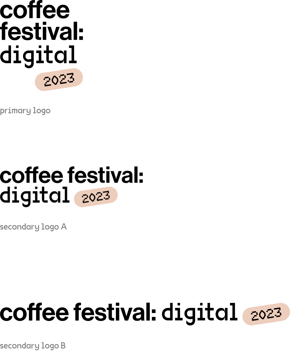
Coffee festival: digital 2023
Disciplines
art-direction
idea & concept
branding
logo design
complex visual identity
app design
UX/UI
Year
2022
Transforming coffee festivals: engaging, inclusive, and flavorful
The festival goes digital — following a survey that found current coffee festivals in the Czech Republic lack visual appeal and fail to engage visitors. The new concept aims to present coffee culture to regular consumers, connoisseurs, and newbies alike, in a vibrant and colorful way. The identity aims to make coffee festivals more inclusive and engaging for all.
Logo design
A logotype is an important part of a brand’s visual identity. I designed a simple logo that can be varied within different formats. The choice of a suitable variant depends on the proportions of the used space. The logo uses the same typography as the entire visual identity: fonts Neue Haas Grotesk Display Pro and VG5000.
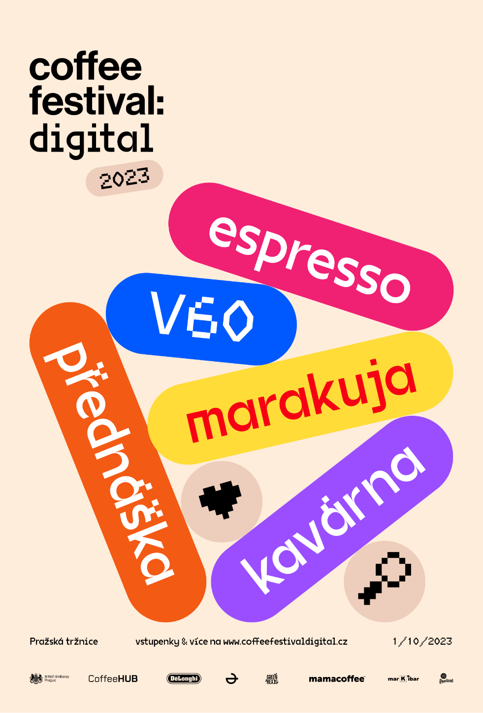
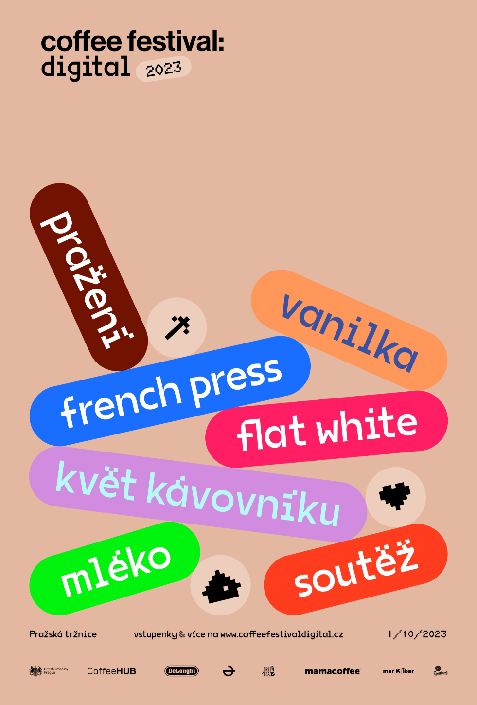
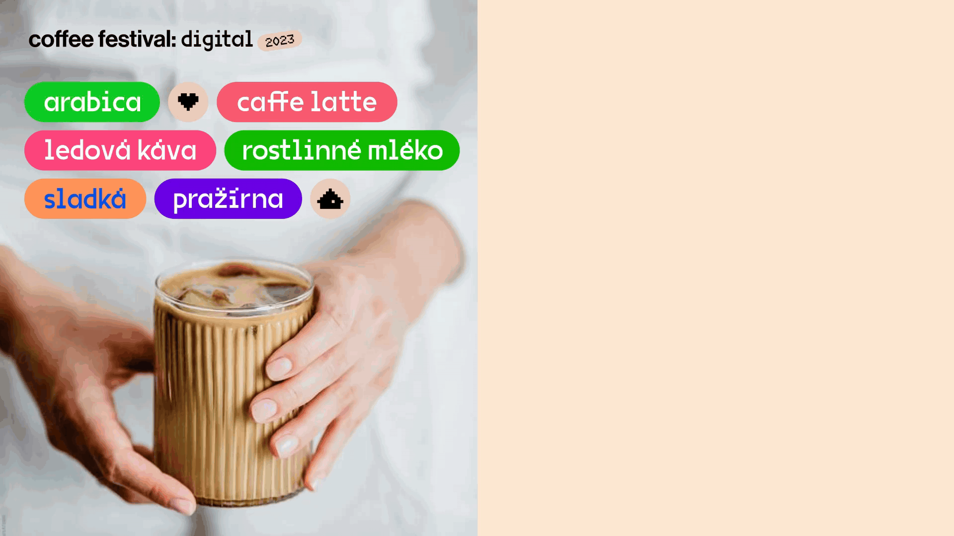
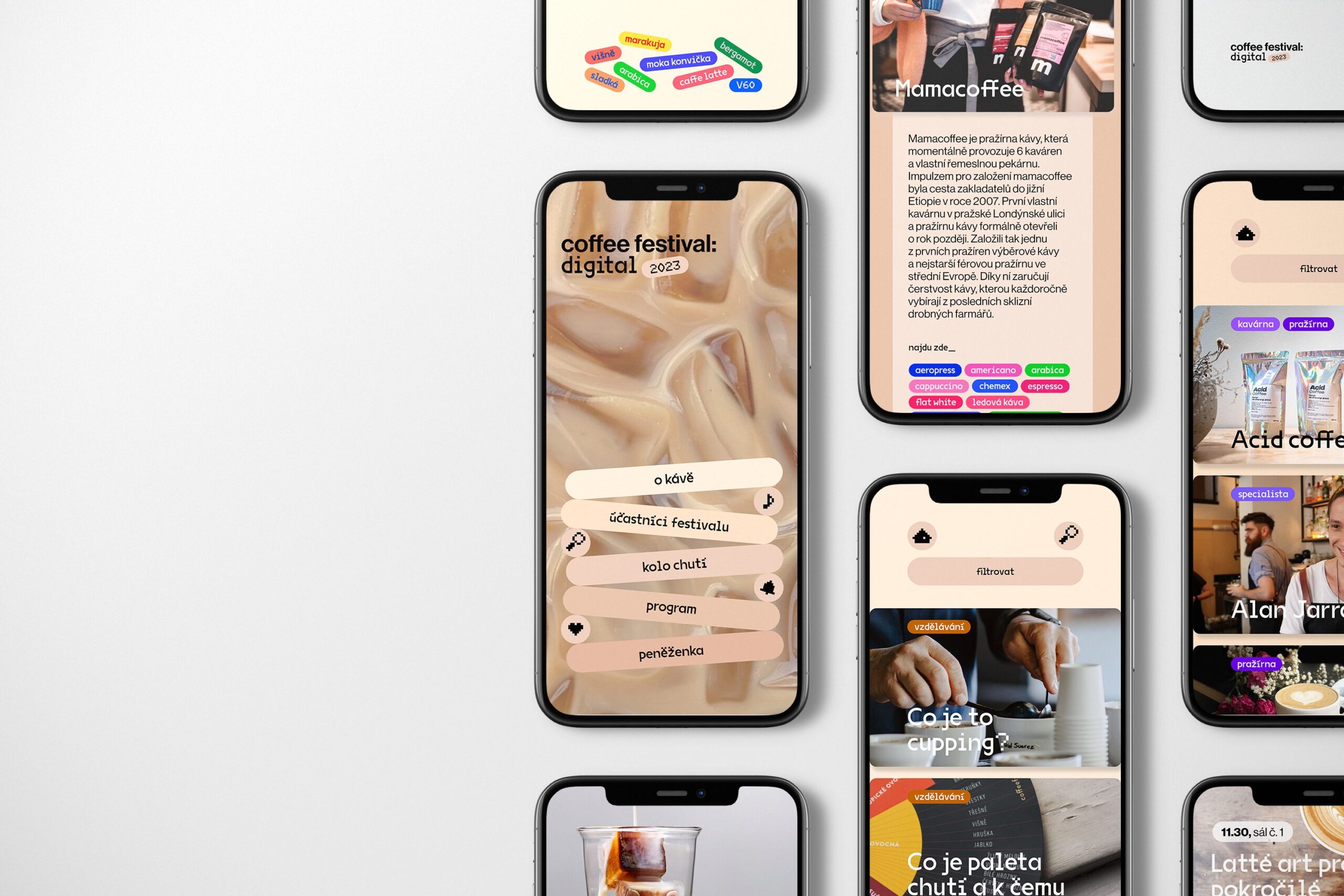
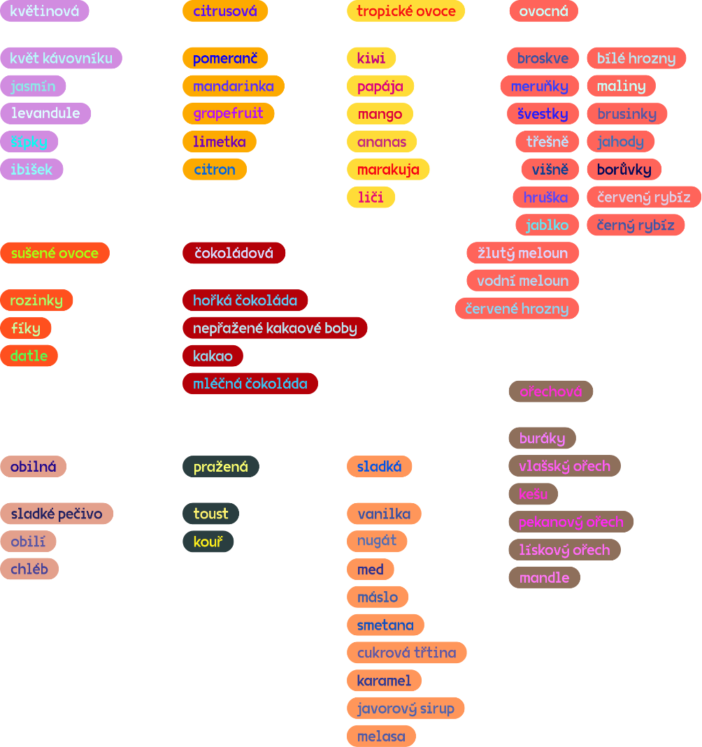
A visually organized tag system
The most striking element which the visual identity works with is not the logo, it is the system of color-differentiated tags. I have designed a visually organized system to provide clear information to visitors of the Coffee Festival. The concept is build on the idea that the coffee consumer can easily get lost in coffee terminology or not fully understand it.
In addition to their primary, i.e. informative, function, individual tags or labels serve as separate objects that can be used in brand communication. Visuality works with tags both in a straight horizontal position and with labels rotated to different angles. This variability aims to add dynamism and playfulness to the visual identity.
Tags: category
The type of category tags combines white text and a colored rounded rectangle background. Furthermore, labels are divided according to color, where the superior color stands for the type of content. Concepts carry a certain shade of superior color.
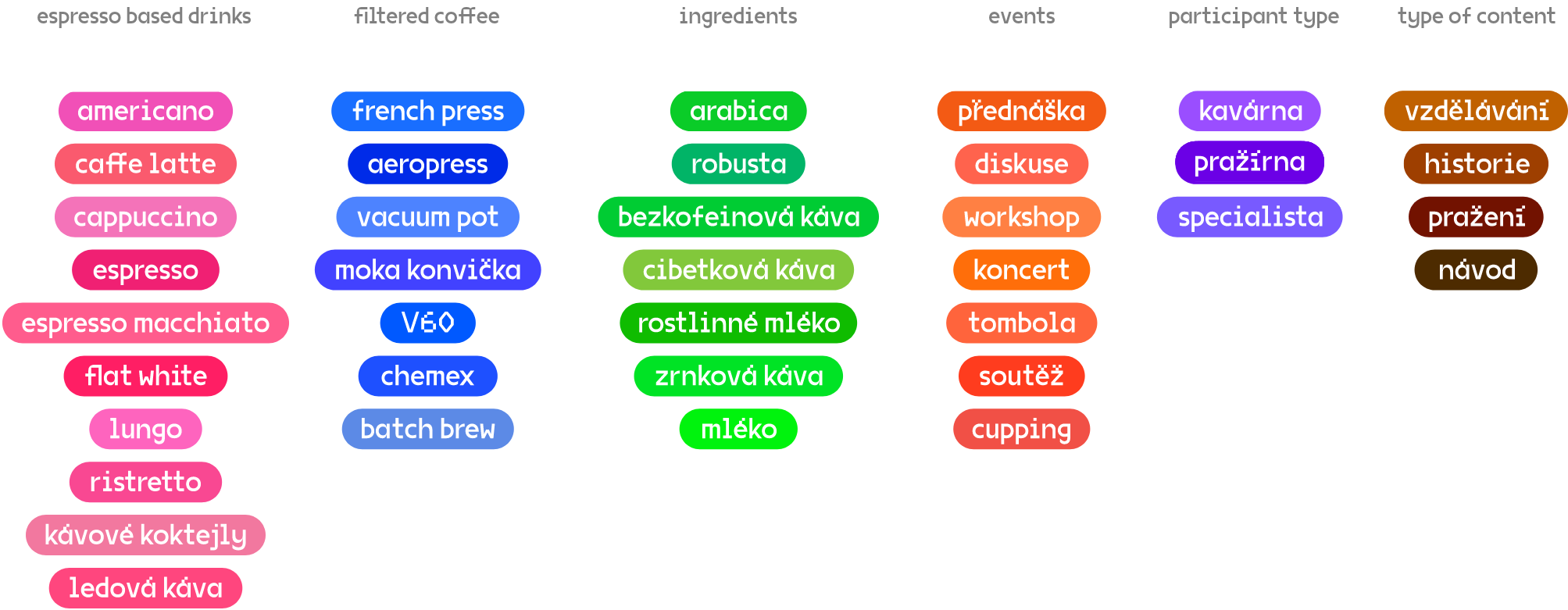
Tags: flavour
The flavor tags combines colorful text and a rounded rectangle colored background. The color of the rounded rectangle refers to the superior taste, e.g. fruity, spicy or herbal. Text color varies for individual flavor. In this way, they visually refer to the variety of flavors and aromas that can be discovered in coffee.
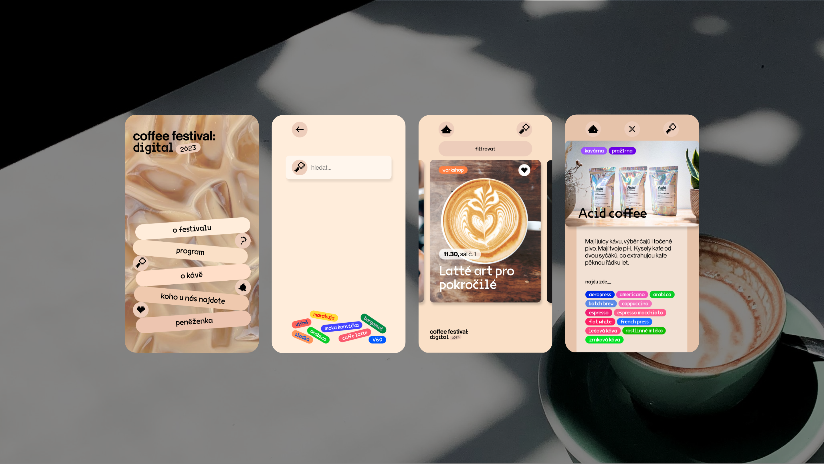
The ultimate festival guide mobile app
I have designed a functional prototype of a festival app that serves as a festival guide, providing visitors with a program overview and a curated directory of cafes, roasters, and specialists along with their detailed descriptions. Additionally, it serves as an educational platform, aiming to enlighten users about diverse aspects of coffee culture.
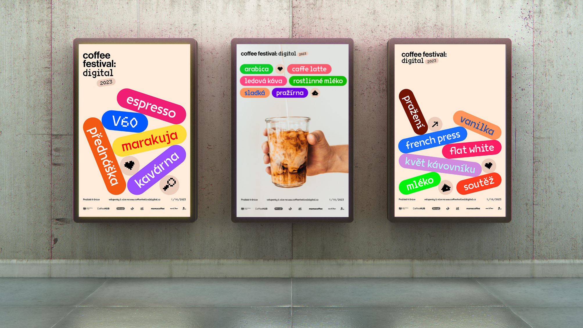
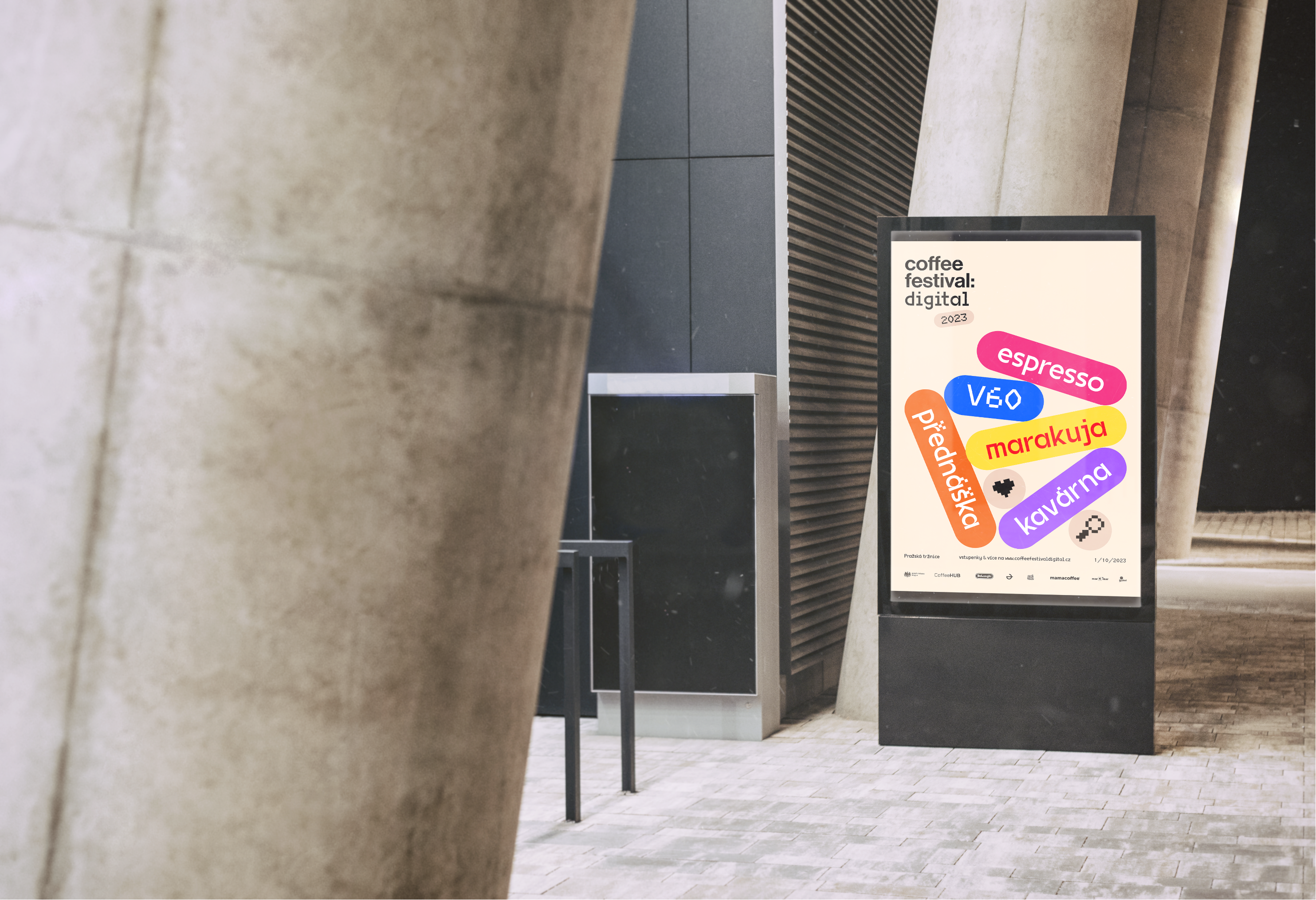
Digital posters
Due to the very concept of this festival, only digital promotional posters are used. With this step, I not only save paper, but also respond to the trend of ubiquitous digitization, which is becoming more and more important in the world of visual communication.